Changelog
How this site got the way it is
How this site got the way it is, newest first. The entry says what changed; beside a few, a note says why, in the maker’s hand. “Considered options” opens what else was on the table.
- 2026-10-10
A separate path for Happy Mail gifts
Happy Mail and its FAQ now point givers to one gift page, replacing instructions to put a recipient’s address on the giver’s subscription. Gift checkout is not open yet.
- 2026-10-07
Happy Mail stays in reach on a phone
The orange Happy Mail button rides the phone header (the cart moves into the menu); category labels sit on a white bar; one email box everywhere; a share image for links.
- 2026-09-05
The changelog, public
This page: how the site got the way it is, the choices with their alternatives, and the comps beside the shipped thing. A quiet link in the footer.
- 2026-09-02
A page for the people who were in the room
After the Orlando workshop: Amy’s note, the photos from the class, and a Back in the studio section. Unlisted: no index, no nav, no sitemap. The site chrome stays.
- 2026-08-29
The same printed QR, retargeted
The event page keeps one fixed address. Per stop, the facts change, the order source changes, and the show discount is reactivated for the window.
- 2026-08-26
Every FAQ answer has its own address
An anchor per question, opening on arrival, so a reply can point at one answer.
- 2026-08-25
Email capture waits behind a switch
Capture blocks in the footer and at the tail of posts render nothing until the switch flips after Amy’s aesthetic pass.
- 2026-08-25
A landing for the YouTube description
A seen-it-on-YouTube hero, a video embed once one is picked, a channel-scoped first-month offer, email capture. Unlisted.
- 2026-08-25
The expired price comes off the page
The re-collection page headlined an offer three weeks past its deadline. It shows the regular price honestly now.
- 2026-08-12
The first envelope, promised by date
The line under the plan cards computes which month’s envelope your order funds, from today’s date. The wording went to Amy as a veto line before it merged.
- 2026-08-12
International shipping, said before you pay
One line in the cart drawer: international orders ship at live USPS rates by weight, shown at checkout. No rate hardcoded.
- 2026-08-12
Start here: twenty posts, chosen from the data
Pageviews over 120 days plus a spread across DIY, journaling, encouragement, and lettering. Near-duplicate guest layouts and personal recaps skipped.
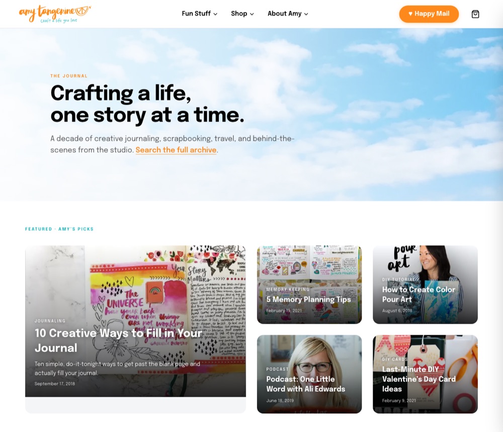
The Journal, Start here on top. - 2026-08-12
Dropdowns that open on a tap
iPad portrait is the desktop breakpoint, and touch has no hover. First tap opens the menu, second follows the link; mouse behavior unchanged.
- 2026-08-10
The camera comes on when the page loads
The August 4 tap gate made visitors hit the button before the camera woke. Used live, the original behavior came back, with a guard for a missing stream.
considered options
- C1Tap to start the camerapicked 8/4Permission is per origin and sticky; one reflexive Block would kill the camera for the whole site.
- C2Prompt on load, guard the missing streampicked 8/10The flag stays as the one-word switch.
- C1Tap to start the camerapicked 8/4
- 2026-08-04
Real subscribers replace the placeholder quotes
Four subscribers in their own words, first name and last initial, from one shared array for every page that shows them.
- 2026-08-04
The photobooth moves onto the site
Its own repo, project, and subdomain retire; the booth becomes a route under Fun Stuff, and the old subdomain redirects here for good.
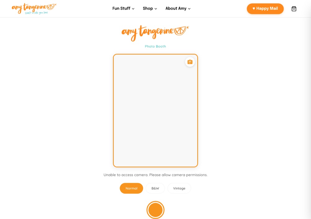
The booth as a route on the site. considered options
- P1Its own subdomain, its own repoReachable only as an external nav link; no measurement at all.
- P2A route on the sitepicked 8/4Look and behavior preserved; the wordmark hides on phones, where the nav already carries it.
- P1Its own subdomain, its own repo
- 2026-07-31
A collaboration leads the faves page
A three-item collection opens Shop My Faves. Single-list refreshes can no longer clobber edits on the others.
- 2026-07-20
One cutoff: the 15th
The first-envelope FAQ lands on both Happy Mail pages, and the cancel answer that said “before the 5th” now agrees with it.
- 2026-07-14
help@ for orders, hello@ for everything else
The contact page splits by inbox, and the subject-line routing goes.
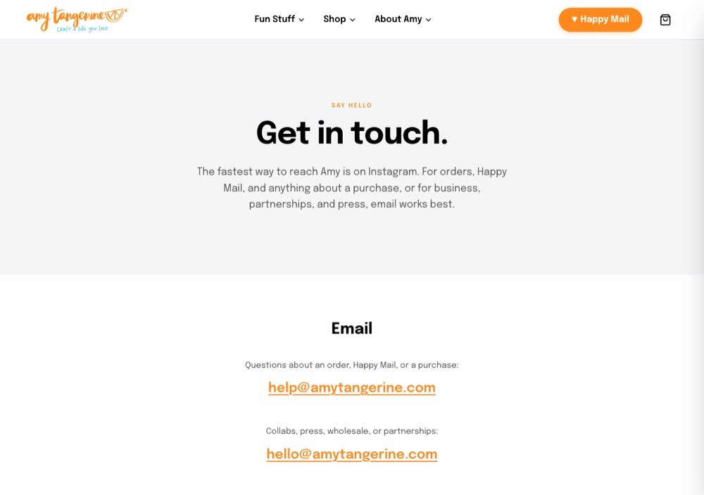
Two doors, said plainly. - 2026-07-07
In Person, and three things in the nav
Events redesigned and renamed In Person: upcoming first, city-led cards, recap video slots. The header becomes Fun Stuff, Shop, About Amy.
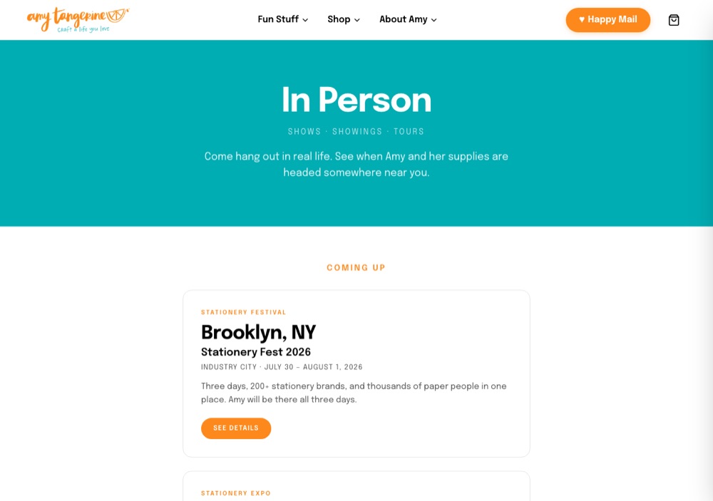
In Person: upcoming first, city-led. - 2026-07-07
A friendlier 404
A dead link lands on a page that helps: three current products, the Journal, a search, the way home.
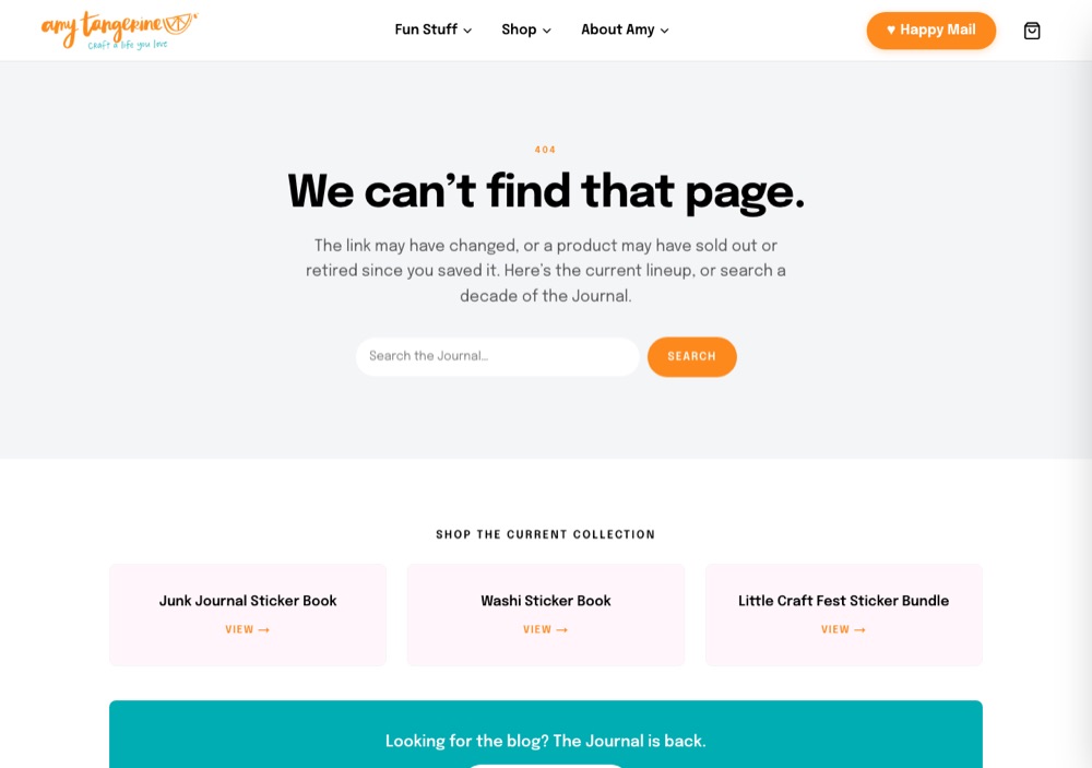
Where a dead link lands. - 2026-07-06
Shop My Faves nests under Shop; My Books joins
The affiliate page becomes a child of Shop, and Amy’s own titles get a section.
- 2026-07-03
The Journal comes back
The blog is reinstated with curation and hygiene: legacy paths redirect, thin posts fold, the archive gets a search.
- 2026-06-24
Shop My Faves
An affiliate page with its own data model behind it: real lists, deep links, images populated from the source.
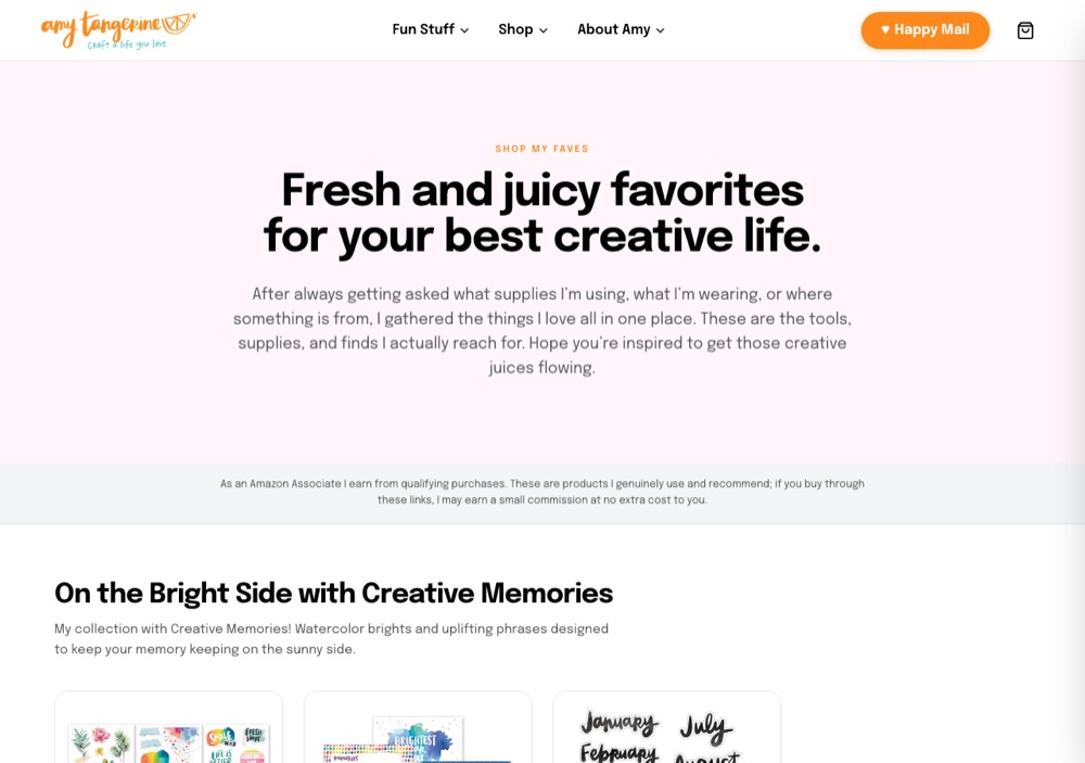
Shop My Faves. - 2026-06-12
Printables get their own tab
A category tab in the shop, excluded from the default grid. A gated preview for drafts follows.
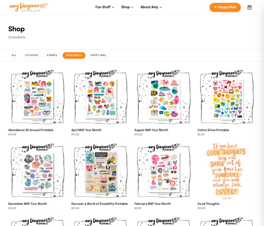
The Printables tab. - 2026-06-03
Tokyo Takeover: the gallery and the waitlist
Real photos from Tokyo and Amy’s copy; the waitlist asks for one name field to match the list it feeds.
- 2026-06-01
Events collapse to one landing page
The separate pages fold into a single events surface with a regrounded voice and verified details.
- 2026-05-29
amytangerine.com goes live
DNS flips from Squarespace on the target Friday and the gate comes off. Eight weeks from scaffold to launch.
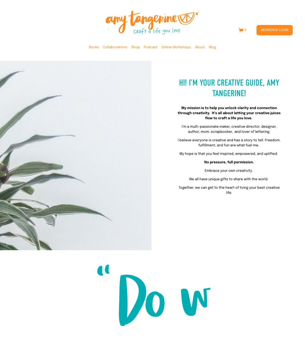
January 2026: the Squarespace site. 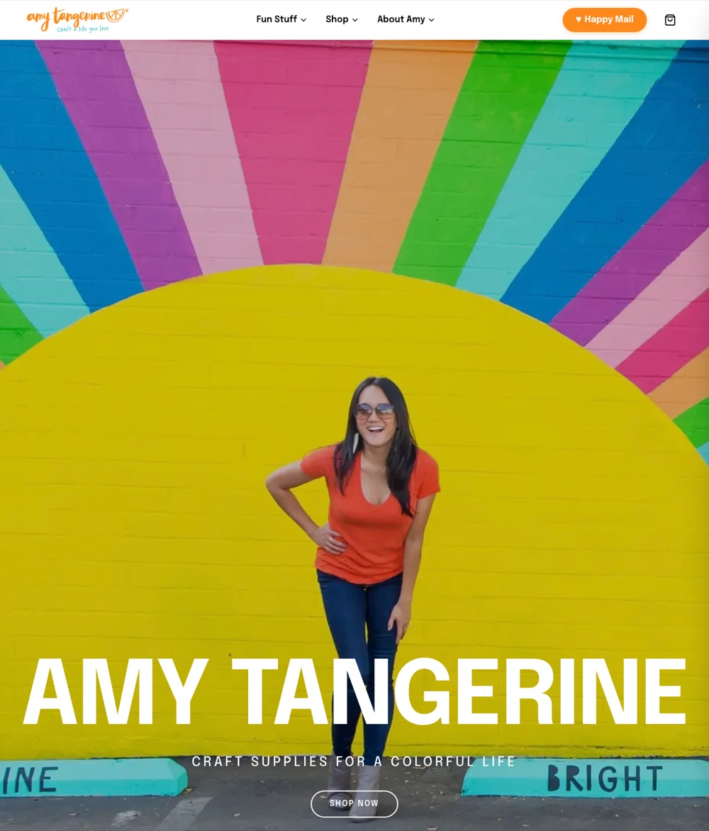
The new site. - 2026-05-29
Happy Mail: four tiles, fan mail, the truth about six months
The hero becomes four real photos of what arrives. “From the mailbox” becomes “Fan mail.” The six-month copy says what it is: a renewing commitment.
- 2026-05-28
The cosmetic pass, with Amy at the desk
The hero becomes the Shine Bright mural shot; the tagline goes full white and bigger. Category tiles get real product shots; the spotlight gets Paper Play 3.

The placeholder hero, April. 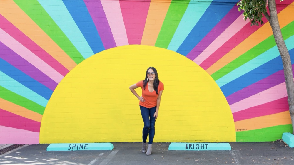
The mural shot, Amy’s pick. - 2026-05-28
Five Instagram posts, in Amy’s order
Six product-photo placeholders give way to five posts she chose, in her order, linking out to her feed.
- 2026-05-27
Every month, a letter from me
Amy picks Option A for Happy Mail: a product-grid hero of what’s in the envelope, plan cards in the same viewport, every button straight to cart. Hand-lettering leaves the marketing.
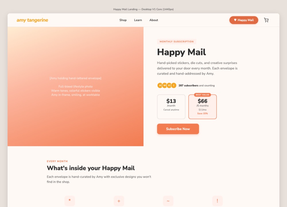
The April wireframe. 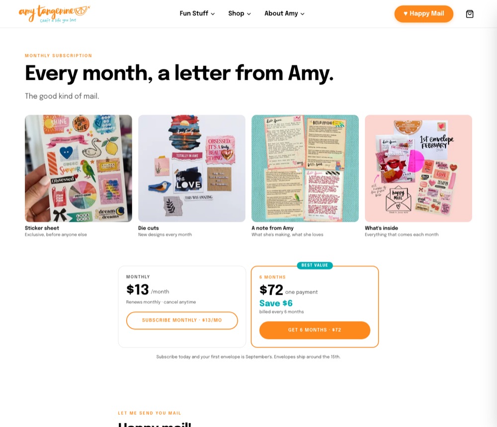
Option A, shipped. considered options
- H1The April landing: split hero, the big stamp graphic, pricing belowPricing cards, What’s Inside, How It Works, a gallery, the FAQ. Photos were placeholders.
- H2Option A: the product-grid heropicked 5/27Die cuts, sticker sheet, envelope, note: the box contents above the fold, plans right under.
- H1The April landing: split hero, the big stamp graphic, pricing below
- 2026-05-27
Contact stays out of the nav
The Contact link added to the mobile drawer the night before comes back out. Happy Mail at the top of the drawer stays.
- 2026-05-27
The favicon is the tangerine slice
Amy’s existing favicon, pulled from the old site and mirrored byte for byte, so the brand survives the cutover in the tab.

The slice. - 2026-05-26
Seven fixes from friends and family
The checkout button resets after eight seconds instead of sticking. Empty categories drop and the grid goes to three. “Image coming soon” replaces the gray box.
- 2026-05-09
An About page, and thirty-two logos
Bio, values, and a collaborations wall of thirty-two brand logos in Amy’s own order, where a text list of six had stood.
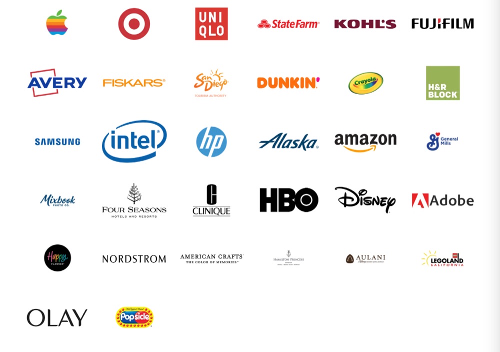
The collaborations wall. - 2026-04-13
The logo is the wordmark
The text wordmark in the nav gives way to Amy’s own logo image, the slice and the tagline.
Her mark, in the header. - 2026-04-11
D3: editorial, with color
Seven homepages on staging, each built to test one question. Amy picked D3 on April 14: the cinematic hero with teal and orange section grounds.
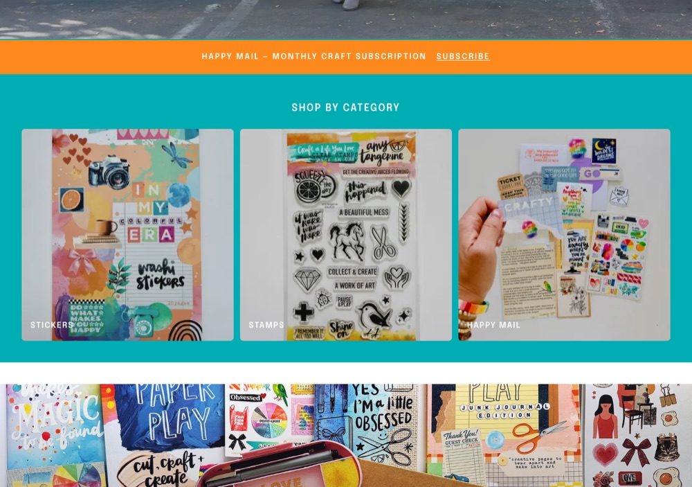
D3 shipped: the teal category grid. considered options
- Av2 CurrentThe control: the existing layout with the real colors and font.
- BAmy’s WorldA portal to everything she does: books, workshops, podcast; a personal headline.
- CCraft FeelHand-drawn accents, softer cards, a warm overlay. Personality over grid.
- DEditorialCinematic hero, tight density, ghost buttons.
- D1Editorial + PlayfulD with squiggly underlines and doodles.
- D2Editorial + PromoD with a Happy Mail conversion hero.
- D3Editorial + Colorpicked 4/14D with teal and orange section backgrounds.
- Av2 Current
- 2026-04-11
Eight nav items become three, and Happy Mail gets a button
The old nav ran to eight items by spring and had no Happy Mail at all. The new one: Shop, Photobooth, About, and a Happy Mail button that never leaves the header.
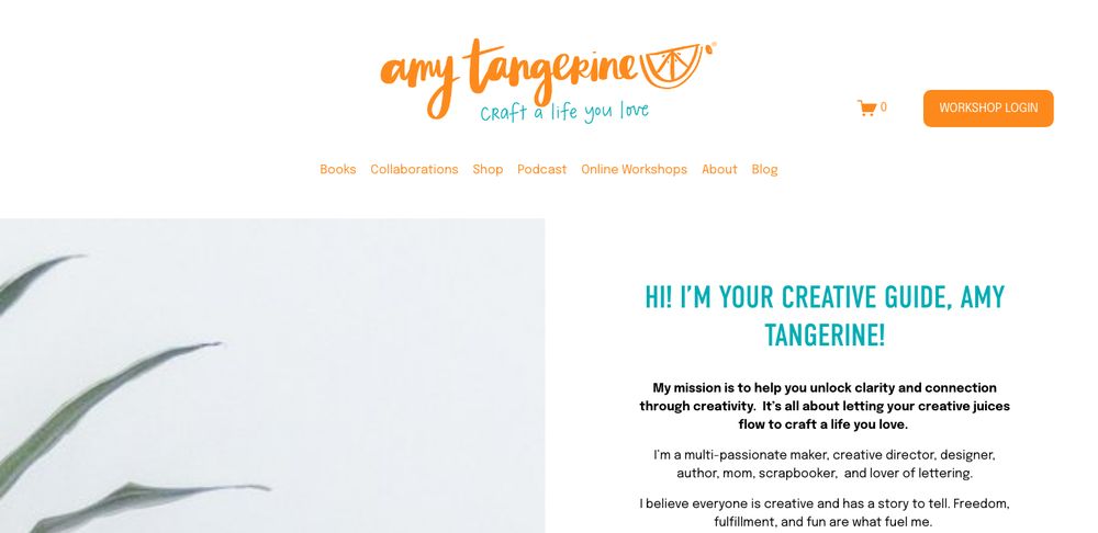
The old header, January 2026: seven links, a login button, no Happy Mail. 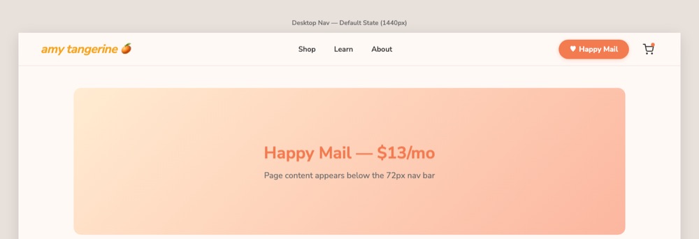
The nav wireframe, April 2. - 2026-04-11
Shop, cart, and product pages
A catalog from Shopify, the shop grid, product pages, and a cart drawer with a count badge. Prices live from the store, never typed in.
- 2026-04-11
The Happy Mail landing page
A page instead of a product listing: pricing cards, What’s Inside, How It Works, past months, testimonials, the FAQ. Every subscribe button measured.
- 2026-04-06
The real brand, not the wireframe’s guess
One orange, not two; a brighter teal; pure white and true black; Epilogue. Pulled from the live site instead of estimated.
considered options
- T1The wireframe paletteGolden and coral oranges, a sage teal, cream paper, Nunito Sans.
- T2The live site’s own tokenspicked 4/6#FD891C, #00ADB3, white, black, Epilogue. Not a creative choice: her brand.
- T1The wireframe palette
- 2026-04-04
A prototype instead of a Figma file
Wireframes as HTML pages, then a Next.js scaffold the same day. Amy reviews a working site, not a mockup.
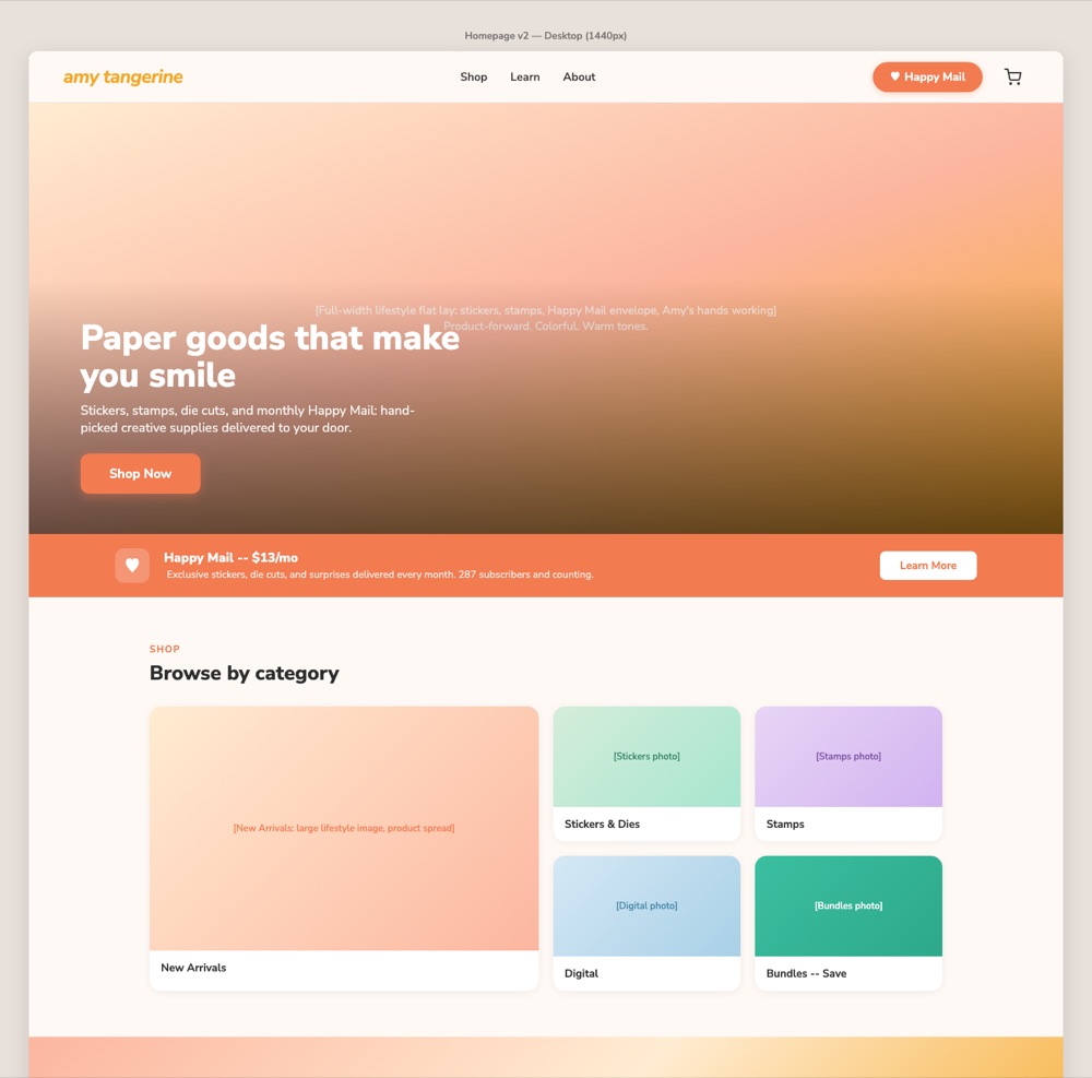
The homepage wireframe, April 4.